
Caseflow virtual hearings design
Brief
I worked as a senior designer and researcher on Caseflow Hearings (a sub-product of Caseflow) in an individual contributor role. Caseflow Hearings supports the scheduling and preparation for hearings on veterans appeals. I was on a team with three other designers (the Hearings design lead, one early-career, and one mid-career designer) embedded within a cross-functional agile team.
Hearings are one of the main reasons veterans wait a long time for a decision on an appeal (an average wait time of about five years). Most veterans who appeal their claims request to have a hearing to discuss their appeal, but the VA’s ability to hold hearings has been limited by the availability of Veterans Law Judges, physical hearing rooms, and hearing coordinators. To address the second limitation, the VA began piloting virtual (remote) hearings in the summer of 2019. When the pandemic hit the following spring, all in-person hearings were postponed indefinitely, and we supported the VA in pivoting quickly to all virtual hearings by developing and releasing an MVP for scheduling virtual hearings within Caseflow.
Because of the need to release a first draft of this functionality as quickly as possible, that first release left a lot to be desired in terms of user experience. We followed up this first release with a more thoughtful workflow for scheduling virtual hearings.
One of our main challenges was to reimagine the entire scheduling workflow, which had been originally designed for in-person hearings. Virtual hearings differ from in-person hearings in some key ways:
- Virtual hearings are scheduled individually, whereas in-person hearings are scheduled in batches. That is, for in-person hearings, veterans and their representatives for several hearings show up at the same time, and the Veterans Law Judge calls each group back one at a time until all hearings are complete. For virtual hearings, the VA needed to give each veteran a specific start time so they could join from their own device.
- Remote hearings require more attention from the hearing coordinators to ensure that the veteran can connect prior to the hearing taking place, and more in-the-moment tech support during the hearing.
- Remote hearings can take place across multiple time zones (the judge, the veteran, and the veteran’s representative can all be in different time zones), while in-person hearings are scheduled for the time zone where they are held.
When I joined the Caseflow Hearings team, the Hearings design lead had already worked out a high level workflow and needed the team to translate that into interface design. We created a clickable prototype of the workflow that introduced several major changes:
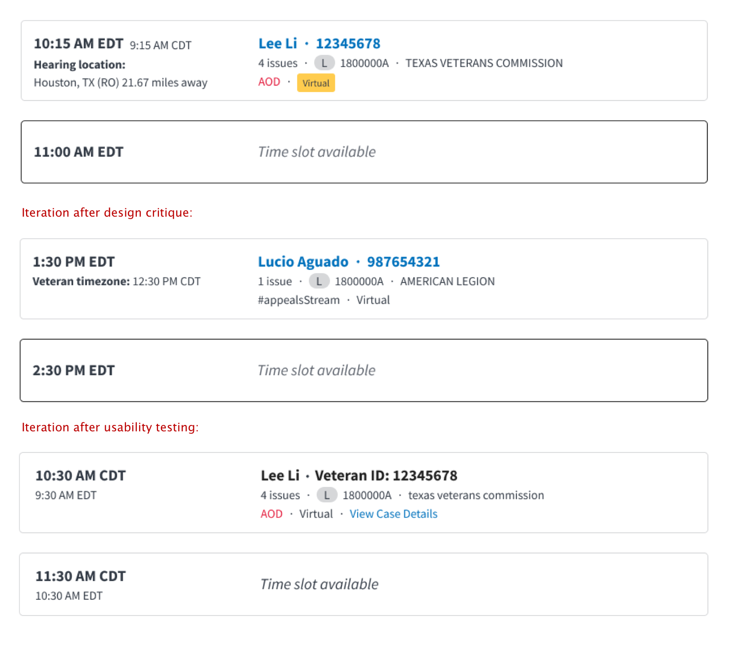
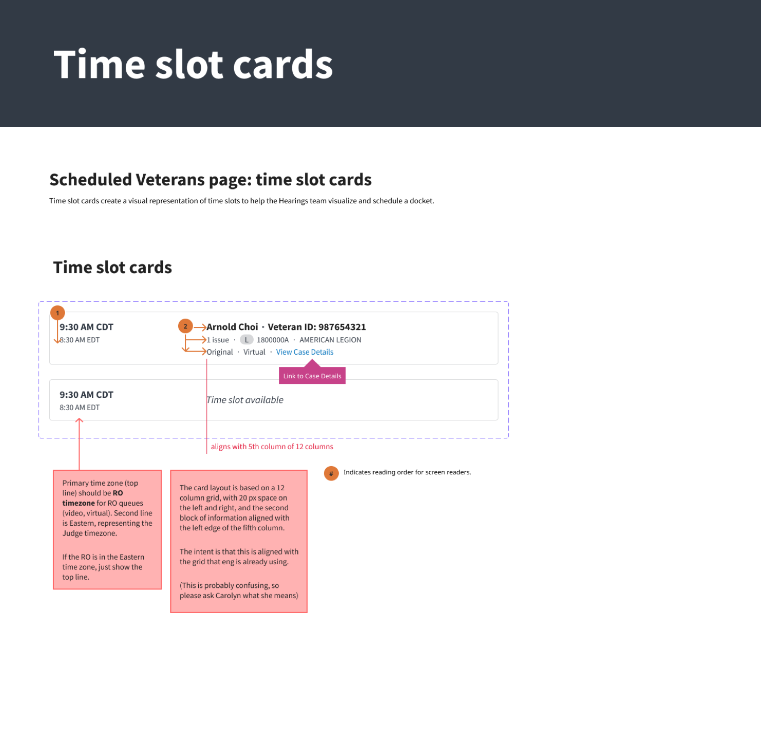
- Time slot cards, visual representations of a hearing times.
- An appeal information sidebar that is persistent throughout the scheduling flow, to reduce the amount of information a hearing coordinators needs to keep in their head while scheduling
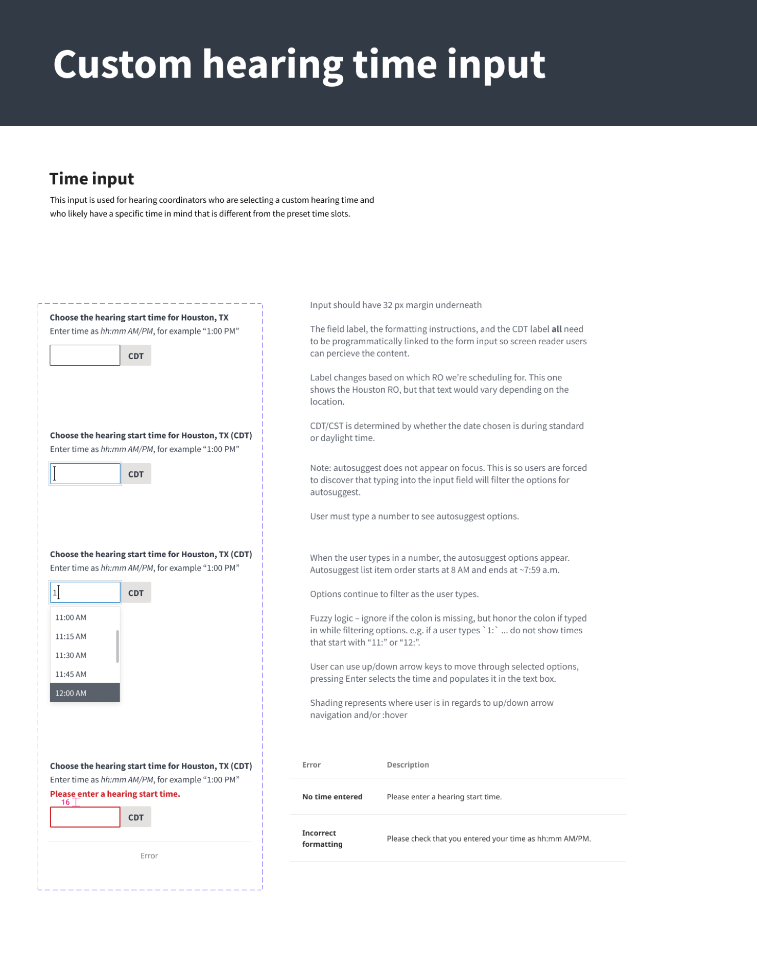
- The ability to override the preset hearing time slots with a custom time, since hearing coordinates often need to make exceptions to accommodate veterans needs.
Note: All images on this page use fake data.
Watch a walkthrough of our scheduling prototype
We tested these concepts with hearing coordinators in an interactive Figma prototype. We identified a number of improvements to make:
- Hearing coordinators wanted more detailed information in the success banner at the end of the workflow. They often work with multiple tabs open, and use this to keep track of what hearings they’ve already scheduled.
- Hearing coordinators could not tell that the veteran’s name linked to the Case Details page, despite this being a common pattern within the rest of the application. We revised the design to make that link more findable.
- Hearing coordinators liked seeing the timezone for the veteran and the timezone for the judge, but wanted the veteran’s timezone on top as they considered it more important. We made that switch.
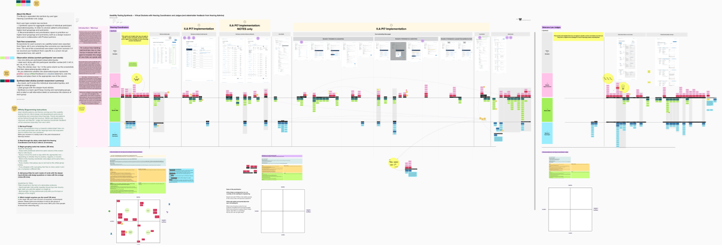
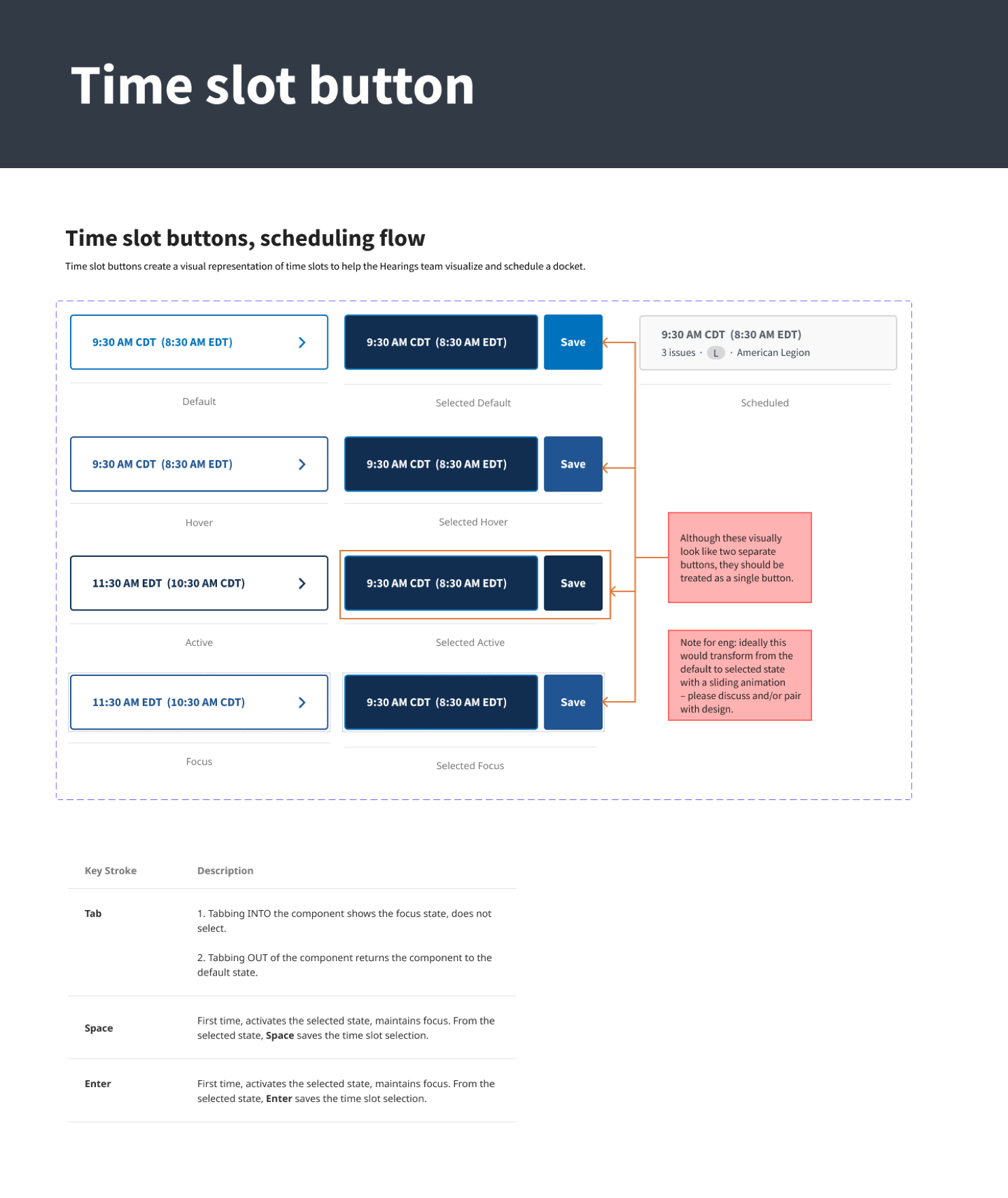
As we cleaned up the designs, I distilled common components to add to our UI Kit, and provided accessibility and design annotations for engineers.
What I did
- Created interaction designs for displaying a docket day and scheduled and available time zones.
- Reviewed all designs within the flow to ensure consistency between different designers.
- Paired with a more early-career designer to develop the usability testing plan and led the team through synthesizing findings.
- Iterated on microinteractions based on usability testing.
- Provided guidance for keyboard interaction and coached other designers on designing for accessibility.
- Distilled repeated UI patterns for inclusion in our UI Kit and design system.
Key Techniques and deliverables
- usability testing
- interactive prototypes
- user interviews
- affinity diagramming
- interaction design
- design system
- accessibility
Results
We are still collecting data on if the new workflow is helping to avoid postponements due to scheduling mistakes, and if it helps hearing coordinators work more quickly.